Content switcher
Color
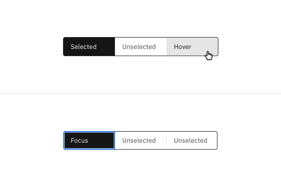
Content switchers have two main states: selected and unselected. By default,
content switcher buttons are unselected with the selected state using a high
contrast color.
| Element | Property | Color token |
|---|---|---|
| Unselected button | background-color | $background |
| text color | $text-secondary | |
| Selected button | background-color | $layer-selected-inverse |
| text color | $text-inverse | |
| Divider | border | $border-subtle |
Interactive states
Hover states only apply to unselected buttons.
| State | Property | Color token |
|---|---|---|
| Hover | background-color | $background-hover |
| text color | $text-primary | |
| Focus | border | $focus |
| Disabled | background-color | transparent |
| text color | $text-disabled | |
| border | $border-disabled |

Typography
Content switcher label text should be set in sentence case, with only the first word in a phrase and any proper nouns capitalized. The label text should not exceed three words.
| Element | Font-size (px/rem) | Font-weight | Type token |
|---|---|---|---|
| Label | 14 / 0.875 | Regular / 400 | $body-compact-01 |
Structure
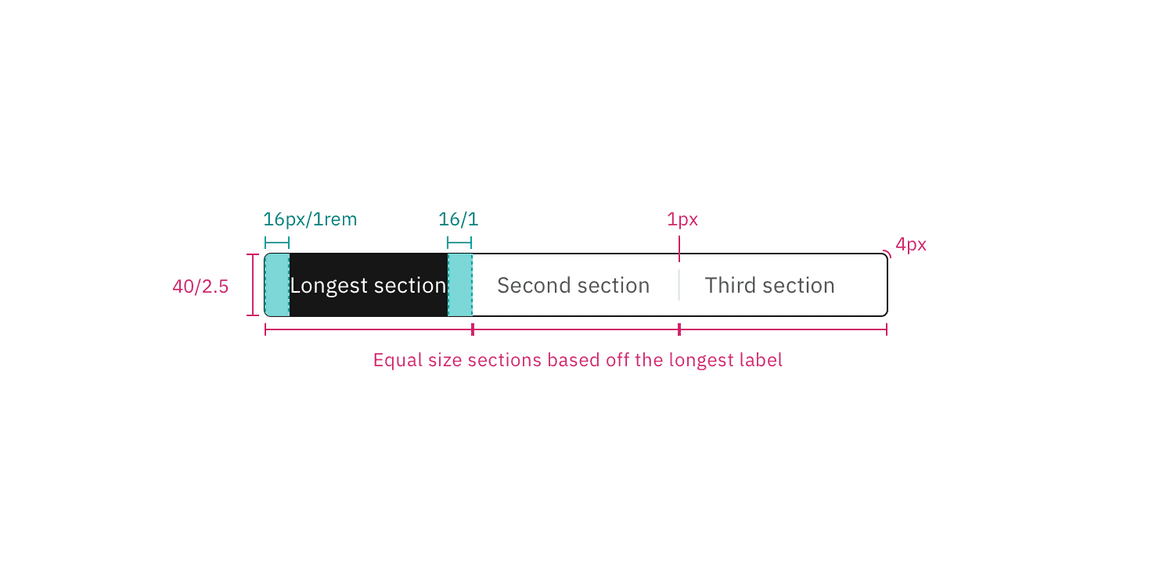
Content switchers must have at least two options for the user to choose from. Each container that makes up the content switcher is equal in size. The width of a container is determined by the length of the longest container option text plus the 16 px / 1rem on both sides of the text.
| Element | Property | px / rem | Spacing token |
|---|---|---|---|
| Container | corner radius | 4px | – |
| Divider | border | 1px | – |
| Button label | padding-left, padding-right | 16 / 1 | $spacing-05 |

Structure and spacing measurements for the default size content switcher | px / rem
Sizes
| Size | Height px / rem |
|---|---|
| Small (sm) | 32 / 2 |
| Medium (md) | 40 / 2.5 |
| Large (lg) | 48 / 3 |

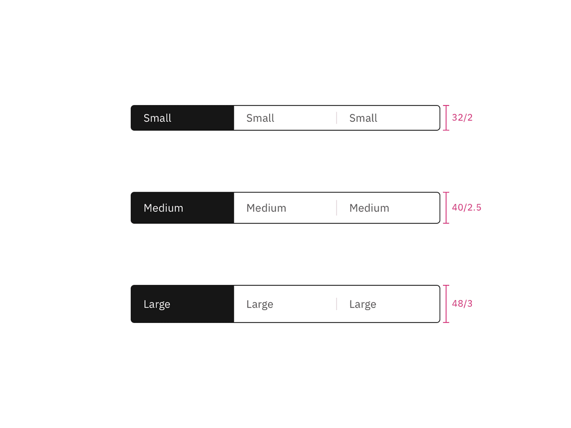
Content switcher sizes | px / rem